Sunday 25 November 2012

Importance of Colours

As an extremely important factor of marketing and magazines, I have decided to investigate the significance and hidden meanings behind specific colours to help me choose an appropriate colour scheme for my music magazine. Colours can be known to increase brand recognition by 80%, whilst ads are read up to 42% more than similar ads in black and white. Lastly, up to 85% of the reason people decide to buy product.

From research I discovered that what evokes a reaction from colour in one person may evoke a very different reaction in someone else as this is down to personal preference or sometimes cultural background.

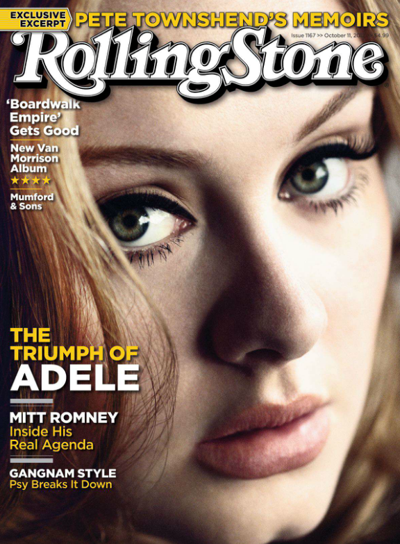
Looking at the colour red, it could be associated with violence, blood and heat or the complete opposite of love and passion.  In terms of magazines, red can be a powerful accent colour, giving a strong and high-end feel; It can have an overwhelming effect if it is used too much in designs but is a great colour to use when power or passion want to be represented. As a versatile colour, brighter versions of red can be seen as more energetic and darker shades being more powerful and elegant. Not only does it draw attention, but it is also the colour that the eyes are drawn to first. 

Another colour such as yellow can be seen to give a sense of positivity or energy, therefore associated with creativity and imagination. Furthermore, purple is the colour of mourning for some people, whilst darker shades connoting wealth, luxury royalty, traditionally. Lighter purples, however, can be considered more romantic and calming. 


Black is commonly used in edgier designs, as well as in very elegant designs. It can be either conservative or modern, traditional or unconventional, depending on the colours it’s combined with. In design, black is commonly used for typography and other functional parts, because of it’s neutral effect. Black can make it easier to convey a sense of sophistication and mystery in a design.
In magazines, white is generally considered a neutral backdrop that lets other colours in a design have a larger voice. It can help to convey cleanliness and simplicity, and is popular in simple designs. White can also portray either winter or summer, depending on the other design motifs and colours that surround it.
  • Red: Passion, Love, Anger
  • Orange: Energy, Happiness, Vitality
  • Yellow: Happiness, Hope, Deceit
  • Green: New Beginnings, Abundance, Nature
  • Blue: Calm, Responsible, Sadness
  • Purple: Creativity, Royalty, Wealth
  • Black: Mystery, Elegance, Evil
  • Gray: Moody, Conservative, Formality
  • White: Purity, Cleanliness, Virtue
  • Brown: Nature, Wholesomeness, Dependability
  • Tan or Beige: Conservative, Piety, Dull
  • Cream or Ivory: Calm, Elegant, Purity

Overall, from this research into colour and its effects, I have decided that I would like to include the colours red, black, white, purple and possibly blue, and these are all appropriate for both genders, my genre, and my target audience. However, just like my flat plans, I am aware that these may change further on in the production of my magazine, and I may include various other colours which I will write about if these changes occur. 


Thursday 22 November 2012

Flat Plans


Above is a scan of my flat plan for my music magazine's front cover. This plan involves the idea of using a main image with a close up of a female looking directly into the camera to engage with the audience and draw them into the magazine. From initial research of other magazines, I am aware that it is only the most popular and famous brands that have the ability to cover most of the masthead as it still remains recognisable. Therefore, I am certain that no matter how much my plan changes from now, my masthead and tag line will definitely be placed in front of the main image. I have also decided to position the majority of my text including coverlines, the hook, and the secondary image, to the left of the main image so that it doesn't become too covered and lose its effect. However, I would still place the barcode and other smaller details to the bottom left so that it's less noticeable in front of the image. 


For the contents page I am still undecided about the image I would like to use, but I may experiment with a medium close up shot of the same person on the front cover, positioned to the left hand side of the page. This would then allow me to place boxes of text opposite highlighting important and popular articles that should stand out to the consumer. I have initially planned to put 3 smaller images at the top to advertise different features of the magazine, but I may also change this later on. 


Finally, as for the double page spread, I would quite like to take a further away shot so that it contrasts with the cover and shows another side to this featured artist. The text would then cover the remainder of the double page spread, however this will most likely be changed as I construct this. 

Tuesday 20 November 2012

Production Plan.

Above is my production plan that I completed to show the progress of my magazine and the steps I need to take to finish this project. From the initial brief, to researching my target audience, genre and conventions of a typical magazine, the tasks I have completed so far have provided me with the necessary information and ideas to work on my own flat plans.

I can then begin to create my real front cover, contents page and double page spread on Photoshop and from audience feedback, improve and alter this production. 

Lastly, I plan on investigating different publishers that I can use and through marketing and branding, evaluate the successes and improvements I would make in this project.   

Wednesday 14 November 2012

Q Magazine Deconstruction

Above is another deconstruction that I completed on a cover of Q Magazine. Compared to my last Q analysis, I focused more on the different fonts, colours, and the layout, as this is something I'm beginning to think about for my own magazine and can take inspiration from. In particular, I am going to focus on capturing the same effects from this magazine such as the clever use of the z-read, the engaging main image, and the original styles of text that overall make this an effective and desirable cover for the consumer.  

Saturday 10 November 2012

Magazine Article Link

Before I begin to decide on any fonts, I wanted to develop my researching skills and look for articles that could help me with my own magazine. Here is one I found that talks about the significance of typefaces/fonts:

Do typefaces really matter? 

Friday 2 November 2012

Editorial Profiles

Editorial profiles, or editor's letters, are placed near the beginning of the magazine to offer an informal view from the editor/s themselves. They can sometimes provide initial information outlining key features of the issue or personally favoured aspects.


I have attempted to create my own in the hope that I can learn more about editor's letters for when it comes to making one in my music magazine.

Magazine Name

Looking back at my results again, this time at magazine names, the majority of people voted for 'Fusion'. I couldn't help but agree with this as it really captures the idea of the two genres 'Pop' and Rock' together as one 'Pop-Rock' genre. Furthermore, the remaining 'Melody' and 'Harmony' almost didn't suit my style of magazine as they sound more related to an acoustic genre magazine. Therefore, I have finally decided to use the name 'Fusion' as I believe it will work well as a music magazine title.

Audience Profile


I have created my own profile to portray someone within my magazine's target audience of the Pop-Rock genre. I would like it to appeal to others that fall into the older teenager category, whilst although mainly for a female audience, could engage with a male audience also. 

Investigating Target Audience

I have decided to do some further analysis of my primary research and investigate the results of my survey, specifically gender. When initially writing up my results I did not focus on the fact that a large percentage of my feedback was from females, therefore my target audience would be largely female based. 

This pie chart shows the percentage of males and females who answered 'Yes' to the question 'Are you interested in Pop-Rock music? (eg. Charlie Simpson, Maroon 5, The Script, John Mayer, Kelly Clarkson etc.)':


From the 88% females who answered 'Yes', I created another pie chart to show the different ages broken down for this gender. 


This shows that for my chosen genre of Pop-Rock, the majority of readers I've found will be female, specifically older teens. From this I can now base my future decisions about my music magazine on the fact that a large percentage of my readers will be female, but also keeping into consideration my male audience. 


Cover/ Contents/ Double Page Spread - Deconstruction

In order to gain more research on music magazines, I have decided to deconstruct the front cover, contents page, and double page spread from this issue of Rolling Stone. 

Rolling Stone, usually a magazine that is not afraid to hide parts of the masthead, has decided to place the title in front of the main image. Using an iconic figure in the music industry such as Adele, Rolling Stone will draw in readers to this popular artist, increasing their target audience. A close up shot has been used of Adele's face with an engaging expression that creates interest and grabs immediate attention; the masthead is therefore required to be placed in the foreground so it is easily visible and one of the first things we see. 

It is apparent in this front cover that the main colours used are yellow, white, and brown. These simple colours keep the magazine looking light hearted and clean, whilst remaining appealing to the eye. As for text, Rolling Stone has chosen simple, readable text fonts that are conveniently placed prominently to the left side of the magazine as to be noticeable when the magazine is looked at with the z-read. 

Furthermore, capitalisation is present in the form of article titles and artist names, which helps sell the magazine's key features and stands out against the other text. Popular artists have been included in this particular issue to increase interest, such as Mumford & Sons, and Adele. 


Looking at the contents page, I can see that the theme is completely different. New colours of red and black have been used to highlight certain features of the page and make it more interesting to look at. The layout is simple and methodical, with all text placed horizontally against a plain white background which makes it easy to read, an important aspect of a contents page. 

Quotes and key page numbers are included to highlight certain articles, however this does not allow for all pages to be shown, which may confuse some people and it does not show a conventional magazine contents page. To continue, a large image has been placed on the right hand side of the page of an interesting figure to sell the magazine's features and make the consumers want to look at the specific page. 

Overall, Rolling Stone has created a simple but well thought out contents page that provides necessary information whilst remaining readable. 


For this double page spread on Adele, a large image has been used that covers more than half of the page. This striking image will capture the reader's attention straight away and invites them to read this interesting article. A simple title in black offers a brief overview of what is included in the next couple of pages; the readable font shows the idea that text can be interesting and informative at the same time. 


It is also apparent, looking at the next double page spread, that a theme of black and white has been continuously used throughout this article. From this I believe that the writers of Rolling Stone are trying to portray Adele with authenticity and elegance; with any other artist this could be regarded as a colour scheme that does not engage with the reader's, however it easily works with Adele and her classy music. An intriguing quote has been highlighted on the left hand page to sell certain aspects of the article and persuade fans of Adele to read on. Lastly, a second black and white image has been used to show Adele in the process of recording, which will relate to the readers of this magazine and show this artist as an authentic musician.  

As my first deconstruction of a contents page and double page spread, I am pleased that I can come away with information and ideas to incorporate into my own music magazine that will hopefully capture certain features of the ones above. 

Half Term Tasks


Here is a list of things I should have completed by the end of half term:

  • Initial research into music magazines.
  • Have selected your chosen genre for your magazine.
  • Undertaken primary and secondary research into your chosen genre.
  • Carried out audience research.
  • Have created an audience profile – a profile of your average target audience member.
  • Consider creating a mood board about your genre.
  • Research what an editorial profile is and try writing one.
  • Have thought of your name or have a few choices.  I recommend asking for opinions on this.  Remember, this means you can say WHY you have made the choice you have.
  • Have a draft plan of your front cover.  You may have more than one.