Thursday, 27 December 2012
Stages of making my front cover
Above are the specific stages of creating my front cover which I have shown through a presentation I made on Prezi. From the completion of my magazine cover I can ask for feedback from people in my target audience and look for ways to improve.
Friday, 7 December 2012
Photoshoot Risk Assessment

Sunday, 25 November 2012
Importance of Colours

From research I discovered that what evokes a reaction from colour in one person may evoke a very different reaction in someone else as this is down to personal preference or sometimes cultural background.
Looking at the colour red, it could be associated with violence, blood and heat or the complete opposite of love and passion. In terms of magazines, red can be a powerful accent colour, giving a strong and high-end feel; It can have an overwhelming effect if it is used too much in designs but is a great colour to use when power or passion want to be represented. As a versatile colour, brighter versions of red can be seen as more energetic and darker shades being more powerful and elegant. Not only does it draw attention, but it is also the colour that the eyes are drawn to first.
Another colour such as yellow can be seen to give a sense of positivity or energy, therefore associated with creativity and imagination. Furthermore, purple is the colour of mourning for some people, whilst darker shades connoting wealth, luxury royalty, traditionally. Lighter purples, however, can be considered more romantic and calming.
Black is commonly used in edgier designs, as well as in very elegant designs. It can be either conservative or modern, traditional or unconventional, depending on the colours it’s combined with. In design, black is commonly used for typography and other functional parts, because of it’s neutral effect. Black can make it easier to convey a sense of sophistication and mystery in a design.
In magazines, white is generally considered a neutral backdrop that lets other colours in a design have a larger voice. It can help to convey cleanliness and simplicity, and is popular in simple designs. White can also portray either winter or summer, depending on the other design motifs and colours that surround it.
- Red: Passion, Love, Anger
- Orange: Energy, Happiness, Vitality
- Yellow: Happiness, Hope, Deceit
- Green: New Beginnings, Abundance, Nature
- Blue: Calm, Responsible, Sadness
- Purple: Creativity, Royalty, Wealth
- Black: Mystery, Elegance, Evil
- Gray: Moody, Conservative, Formality
- White: Purity, Cleanliness, Virtue
- Brown: Nature, Wholesomeness, Dependability
- Tan or Beige: Conservative, Piety, Dull
- Cream or Ivory: Calm, Elegant, Purity
Overall, from this research into colour and its effects, I have decided that I would like to include the colours red, black, white, purple and possibly blue, and these are all appropriate for both genders, my genre, and my target audience. However, just like my flat plans, I am aware that these may change further on in the production of my magazine, and I may include various other colours which I will write about if these changes occur.
Thursday, 22 November 2012
Flat Plans

Above is a scan of my flat plan for my music magazine's front cover. This plan involves the idea of using a main image with a close up of a female looking directly into the camera to engage with the audience and draw them into the magazine. From initial research of other magazines, I am aware that it is only the most popular and famous brands that have the ability to cover most of the masthead as it still remains recognisable. Therefore, I am certain that no matter how much my plan changes from now, my masthead and tag line will definitely be placed in front of the main image. I have also decided to position the majority of my text including coverlines, the hook, and the secondary image, to the left of the main image so that it doesn't become too covered and lose its effect. However, I would still place the barcode and other smaller details to the bottom left so that it's less noticeable in front of the image.

For the contents page I am still undecided about the image I would like to use, but I may experiment with a medium close up shot of the same person on the front cover, positioned to the left hand side of the page. This would then allow me to place boxes of text opposite highlighting important and popular articles that should stand out to the consumer. I have initially planned to put 3 smaller images at the top to advertise different features of the magazine, but I may also change this later on.

Finally, as for the double page spread, I would quite like to take a further away shot so that it contrasts with the cover and shows another side to this featured artist. The text would then cover the remainder of the double page spread, however this will most likely be changed as I construct this.
Tuesday, 20 November 2012
Production Plan.

I can then begin to create my real front cover, contents page and double page spread on Photoshop and from audience feedback, improve and alter this production.
Lastly, I plan on investigating different publishers that I can use and through marketing and branding, evaluate the successes and improvements I would make in this project.
Wednesday, 14 November 2012
Q Magazine Deconstruction

Saturday, 10 November 2012
Magazine Article Link
Before I begin to decide on any fonts, I wanted to develop my researching skills and look for articles that could help me with my own magazine. Here is one I found that talks about the significance of typefaces/fonts:
Do typefaces really matter?
Do typefaces really matter?
Friday, 2 November 2012
Editorial Profiles
Editorial profiles, or editor's letters, are placed near the beginning of the magazine to offer an informal view from the editor/s themselves. They can sometimes provide initial information outlining key features of the issue or personally favoured aspects.

I have attempted to create my own in the hope that I can learn more about editor's letters for when it comes to making one in my music magazine.
Magazine Name

Audience Profile

I have created my own profile to portray someone within my magazine's target audience of the Pop-Rock genre. I would like it to appeal to others that fall into the older teenager category, whilst although mainly for a female audience, could engage with a male audience also.
Investigating Target Audience
I have decided to do some further analysis of my primary research and investigate the results of my survey, specifically gender. When initially writing up my results I did not focus on the fact that a large percentage of my feedback was from females, therefore my target audience would be largely female based.
This pie chart shows the percentage of males and females who answered 'Yes' to the question 'Are you interested in Pop-Rock music? (eg. Charlie Simpson, Maroon 5, The Script, John Mayer, Kelly Clarkson etc.)':

From the 88% females who answered 'Yes', I created another pie chart to show the different ages broken down for this gender.

This shows that for my chosen genre of Pop-Rock, the majority of readers I've found will be female, specifically older teens. From this I can now base my future decisions about my music magazine on the fact that a large percentage of my readers will be female, but also keeping into consideration my male audience.
Cover/ Contents/ Double Page Spread - Deconstruction
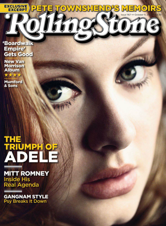
Rolling Stone, usually a magazine that is not afraid to hide parts of the masthead, has decided to place the title in front of the main image. Using an iconic figure in the music industry such as Adele, Rolling Stone will draw in readers to this popular artist, increasing their target audience. A close up shot has been used of Adele's face with an engaging expression that creates interest and grabs immediate attention; the masthead is therefore required to be placed in the foreground so it is easily visible and one of the first things we see.
It is apparent in this front cover that the main colours used are yellow, white, and brown. These simple colours keep the magazine looking light hearted and clean, whilst remaining appealing to the eye. As for text, Rolling Stone has chosen simple, readable text fonts that are conveniently placed prominently to the left side of the magazine as to be noticeable when the magazine is looked at with the z-read.
Furthermore, capitalisation is present in the form of article titles and artist names, which helps sell the magazine's key features and stands out against the other text. Popular artists have been included in this particular issue to increase interest, such as Mumford & Sons, and Adele.

Looking at the contents page, I can see that the theme is completely different. New colours of red and black have been used to highlight certain features of the page and make it more interesting to look at. The layout is simple and methodical, with all text placed horizontally against a plain white background which makes it easy to read, an important aspect of a contents page.
Quotes and key page numbers are included to highlight certain articles, however this does not allow for all pages to be shown, which may confuse some people and it does not show a conventional magazine contents page. To continue, a large image has been placed on the right hand side of the page of an interesting figure to sell the magazine's features and make the consumers want to look at the specific page.
Overall, Rolling Stone has created a simple but well thought out contents page that provides necessary information whilst remaining readable.

For this double page spread on Adele, a large image has been used that covers more than half of the page. This striking image will capture the reader's attention straight away and invites them to read this interesting article. A simple title in black offers a brief overview of what is included in the next couple of pages; the readable font shows the idea that text can be interesting and informative at the same time.


It is also apparent, looking at the next double page spread, that a theme of black and white has been continuously used throughout this article. From this I believe that the writers of Rolling Stone are trying to portray Adele with authenticity and elegance; with any other artist this could be regarded as a colour scheme that does not engage with the reader's, however it easily works with Adele and her classy music. An intriguing quote has been highlighted on the left hand page to sell certain aspects of the article and persuade fans of Adele to read on. Lastly, a second black and white image has been used to show Adele in the process of recording, which will relate to the readers of this magazine and show this artist as an authentic musician.
As my first deconstruction of a contents page and double page spread, I am pleased that I can come away with information and ideas to incorporate into my own music magazine that will hopefully capture certain features of the ones above.
Half Term Tasks
Here is a list of things I should have completed by the end of half term:
- Initial research into music magazines.
- Have selected your chosen genre for your magazine.
- Undertaken primary and secondary research into your chosen genre.
- Carried out audience research.
- Have created an audience profile – a profile of your average target audience member.
- Consider creating a mood board about your genre.
- Research what an editorial profile is and try writing one.
- Have thought of your name or have a few choices. I recommend asking for opinions on this. Remember, this means you can say WHY you have made the choice you have.
- Have a draft plan of your front cover. You may have more than one.
Thursday, 18 October 2012
Audience Theories
"Audiences are not blank sheets of paper on which media messages can be written; members of an audience will have prior attitudes and beliefs which will determine how effective media messages are." - Abercrombie 1996, 140
1. Dominant reading:
Dominant reading is where the reader shares the programme's code (its meaning system of values, attitudes, beliefs and assumptions). It fully accepts the preferred reading, a reading which may not have been the result of any conscious idea on the part of the programme creators.
2. Negotiated reading:
When a reader partly shares the programme's code and broadly accepts the preferred reading but modifies it to reflect their position and interests, this is called negotiated reading.
"No audience member will interpret the media message in the same way..."
3. Oppositional reading:
The reader doesn't share the code and rejects the preferred reading, offering an alternative interpretation.
Learning these above theories, I will make sure to include recognised codes in my music magazine to grab the audience and reader's attention. I am now aware that codes are all interpreted differently so I can consider this when my product is completed and expect a mixture of views and opinions.

Wednesday, 17 October 2012
Questionnaire - Results
Above are the results from my questionnaire that I created on surveymonkey, which I have presented in pie charts and taken screen shots of the last two, as they are harder to transform into this style of graph. Also, by doing this it allowed me to see the percentage of answers, making it clearer to establish the largest vote for each question. I mainly aimed this questionnaire at my target audience of young adults and teenagers, as it appears that over 50% (68%) fitted into this age range. However, I included people over the age of 21 to participate as to gain a range of responses and possibly more views that I can take into consideration.
I firstly asked whether or not Pop-Rock music was something that interested them, and gained a mostly positive response with 67% of people answering 'yes'. Upon further investigation I found that among these 67%, many fell into the category of my target audience as they were below the age of 21. Furthermore, those who replied 'no' were those who were over the age of 21. From this I can conclude that although there were some who did not find interest in my chosen Pop-Rock genre, those who did remain in my target audience of younger people, giving me confidence that I have selected an appropriate genre for my magazine. Next, I asked which of the Masthead names worked best with this Pop-Rock genre, and the vote clearly went to 'Fusion', which I can't help but agree with working in a music magazine. I can now take this into consideration and contemplate using this as my final title. I can also see from the feedback that most people would be willing to pay between £2.00-£2.50 maximum, so I will also bear that in mind when displaying the price of the magazine on the front cover.
Most people (21/25) voted for articles on their favourite artists being an important factor that persuades them to purchase music magazines, so I will therefore try and make my double page spread as appealing as possible to make people want to read it in this way. The next important factor was that of images, with 11 votes out of 25, which encourages me to take care with the pictures I take and choose to use in my magazine, as they grab the target audience's attention right away. The last question I included as primary research for the type of artists I could incorporate into my magazine such as The Script, Coldplay, and John Mayer, and this questionnaire confirmed that they will appeal to my target audience.
Finally, perhaps one of my favourite questions was to investigate what appeals/doesn't appeal to people about my chosen genre. Looking at the responses I can see that most people within my target audience found Pop-Rock music to be catchy, diverse, fun, memorable and interesting, which inspires me to create a magazine that captures all of these key ideas.
Overall, I'm very happy with the results of my primary research, as they have, and will continue to help me throughout the creation of my music magazine, and have given me a further insight into the view of my target audience and reader.
Tuesday, 16 October 2012
Advantages and Disadvantages - Questionnaires
As I am in the process of carrying out my own questionnaire/survey in order to collect primary research for music magazines, I have decided to investigate the many advantages and disadvantages this type of research includes.
Advantages:
The responses are gathered in a standardised way, so questionnaires are more objective, certainly more so than interviews. Generally it is relatively quick to collect information using a questionnaire. However, in some situations they can take a long time not only to design but also to apply and analyse (see disadvantages). Potentially information can be collected from a large portion of a group so you gain a bigger insight into your target audience.
 Disadvantages:
Open ended questions can generate large amounts of data that can take a long time to process and analyse. However, you could limit the space available so the responses are concise or to sample the group of people and survey only a portion of them. Respondents may answer superficially especially if the questionnaire takes a long time to complete. Finally, some people may not be willing to answer the questions fairly.
Overall, questionnaires clearly have their own strengths and weaknesses which I need to take into consideration when reviewing my data. By creating a survey I'm hoping to gain useful data and information including opinions and suggestions to help me to produce a successful music magazine.
Monday, 15 October 2012
Questionnaire
In order to carry out a piece of general primary research, I decided to design an online questionnaire on surveymonkey to gather information about the readers of music magazines. I created a variety of open and closed questions so that the person can give their full, anonymous opinion, giving me more useful feedback that I can use for my own music magazine. Such questions involve the potential title, artists used, and price of the magazine, where I can inevitably review the results that will influence the choices I make to do with this magazine in the future development.
Music Magazine Survey:
Music Magazine Survey:
Sunday, 14 October 2012
Poster Deconstruction Task.
Task: Present a deconstruction of a poster of your choice.

In a recent presentation I completed a deconstruction of the movie poster for 'Taken'. I received the following feedback:
"Firstly, it was very impressive you applied the new terminology of Z read, having only just learnt it, well done! I really like your link to the James Bond poster, now try to consider why they have done this. What might this suggest? This was a very detailed presentation, which certainly looked closely at the poster. Well done for considering the writing and linking it to the poster."
Target/s:
- Keep up using the terminology.
- Consider how this poster may pose a problem for the reader - he has the makings of a bad guy, but we know it's his daughter who is missing.
- Why is it symbolic there is a single man in the foreground?
Task: Present a deconstruction of the NHS quit smoking advert.
.jpg)
In another presentation, this time on a poster for an NHS smoking campaign, I was given more feedback:
"Hannah, this was another excellent piece of analysis - well done! You made some really insightful comments about the set up of the picture - particularly the way the background forces the woman to be even more in focus - now consider why they wanted this to be the case. Good thoughts on why the advertisers used this idea; I agree it was probably a shock tactic."
Target/s:
- Keep up the excellent level of analysis.
- Start to consider why an advertiser would want to use shock tactics - who does this appeal to?
- Consider who this poster is actually aimed at - the smoker or their family?
Monday, 8 October 2012
Initial Research Task.
With over 3,000 consumer magazines for sale in the UK, the music magazine market is very competitive at just under 200 different types that cover the many different genres. These include anything from Classical, Country, Rock, Reggae, to R&B, and even sub genres such as Blues, Contemporary and Teen Pop.
I have chosen 3 of these particular music magazines which you would generally find in different genres to analyse for my initial research, two of which I have my own copies of so I can get a real look at the covers for myself.

The first is a copy of Q Magazine where I observed the fact that this cover conveys a general pop genre, which is not usually the case with all Q issues.

For the second magazine, I analysed how this Top of the Pops Magazine uses many techniques and devices to relate to the target audience of fans of the teen pop genre.
.jpg)
As a result of this initial research, I have decided to narrow down my chosen genre for my own music magazine and create a pop/rock magazine. This enables me to incorporate key elements from different music magazines I have analysed previously that have inspired me and can help me with my own.
Friday, 5 October 2012
Q Magazine Cover Analysis.
Here is my front cover analysis that I completed on a special edition of Q Magazine for my initial research.

Thursday, 27 September 2012
Prelim Exercise
For our Prelim Exercise we were set the task: 'Using DTP and an image manipulation program, produce the front page of a new school/college magazine, featuring a photograph of a student in medium close-up plus some appropriately laid out text and a masthead.'
This is my completed magazine cover which I created on Photoshop. I knew that I wanted to produce a magazine that focused on cooking and the food available at our school, so I decided to photograph two students that showed the process of cooking in the food technology rooms here at King's. Although there are two people in this cover, your main focus is left on the boy on the left, as he is closer to the camera, and I have taken a candid photograph as to make it look less posed, as well as conveying the action of cooking itself.
In terms of composition of this cover, I decided to place the main boy on the right so that when I imported the masthead it would create a z-formation. When you initially see this magazine you would first notice the title, then move onto the highlighted person, read the information and text, and lastly notice the banner at the bottom.
As for colours and text, I wanted to keep the text as simple as possible so it was easy to read, but at the same time interesting, therefore I made it mostly black with a white glow outline to focus the reader's attention. I've created smaller text in blue with less of an outer glow so that it's read last as this information is less important for the magazine. I'm happy with the font I found on dafont: 'Relief BD', because it's very simple but eye catching and this exactly what is needed for a magazine cover.
Overall, I'm really pleased with how this cover turned out as I wasn't too sure on the image at the beginning, but after editing and cropping the original photograph, placing text and other image layers over the top, I can say that it looks appropriate for a school magazine.
 |
| Final Magazine Cover! |
This is my completed magazine cover which I created on Photoshop. I knew that I wanted to produce a magazine that focused on cooking and the food available at our school, so I decided to photograph two students that showed the process of cooking in the food technology rooms here at King's. Although there are two people in this cover, your main focus is left on the boy on the left, as he is closer to the camera, and I have taken a candid photograph as to make it look less posed, as well as conveying the action of cooking itself.
In terms of composition of this cover, I decided to place the main boy on the right so that when I imported the masthead it would create a z-formation. When you initially see this magazine you would first notice the title, then move onto the highlighted person, read the information and text, and lastly notice the banner at the bottom.
As for colours and text, I wanted to keep the text as simple as possible so it was easy to read, but at the same time interesting, therefore I made it mostly black with a white glow outline to focus the reader's attention. I've created smaller text in blue with less of an outer glow so that it's read last as this information is less important for the magazine. I'm happy with the font I found on dafont: 'Relief BD', because it's very simple but eye catching and this exactly what is needed for a magazine cover.
 |
| Original Image |
Wednesday, 19 September 2012
Introduction.
Hello! My name is Hannah. This is my first ever post on Blogger, so I thought I'd answer some questions as to explain why I chose to take Media, and write about some of my interests.
Why have you chosen to study media? And what other subjects are you studying?
I first became interested in taking Media Studies for A-Level when hearing about it from my older sister, Emma; she told me all about how much of an enjoyable subject it was to take, and all of the things you could create within it. As a fairly creative person, Media sounded really appealing to me and I look forward to applying my creative skills to some of the tasks ahead. I also chose to study Art, English Literature, and Geography, which I feel work well together as there is a nice balance between creative and essay-style subjects.
Who is your favourite band/artist, and why?
This is quite an easy question for me, as my favourite artists have stayed pretty much the same for a while. I enjoy listening to music by artists such as The Script, Maroon 5, Taylor Swift, Colbie Caillat, Jason Mraz, Coldplay, Ed Sheeran, John Mayer, and many others. You may also see me listening to film soundtracks, as I've found they make great homework music.
What are your favourite tv programmes?
I don't generally watch a large amount of tv when I'm at home, but when I do, I'd choose to watch shows such as America's Next Top Model, Teen Wolf, Family Guy, The Real Housewives of New York City, and other rubbish with my brother and sister.

What is your favourite film?
My favourite film of all time would have to be The Notebook. I've watched it a countless amount of times, and I just love it. Some of my other favourite films include The Vow, Mean Girls, Taken, Spirited Away, War Horse, and loads of others that I can't remember right now.
What magazines/websites do you read?
I can't really say that I read that many magazines, as the only time I do is when I've stolen one from my sister. But when I do, it could be anything from Glamour to Cosmopolitan, Elle or Company. As for websites, I'd usually just 'read' different blogs on tumblr, and Sugarscape can be pretty funny sometimes.
Subscribe to:
Posts (Atom)