Tuesday, 26 March 2013

Front Cover Improvements + Final Cover

From my initial cover audience feedback, where I asked people who would fit into my target audience of older teenagers, I decided to make a few changes to improve my front cover. 

My initial front cover
My first suggested improvement from feedback was to adjust the swirl drawing on the model's neck, as it was often being confused for a tattoo and almost made that area of the cover look too busy. Therefore, I decided to remove it completely as I was happy with just the one doodle in the top left hand corner in order to bring fun to my magazine.

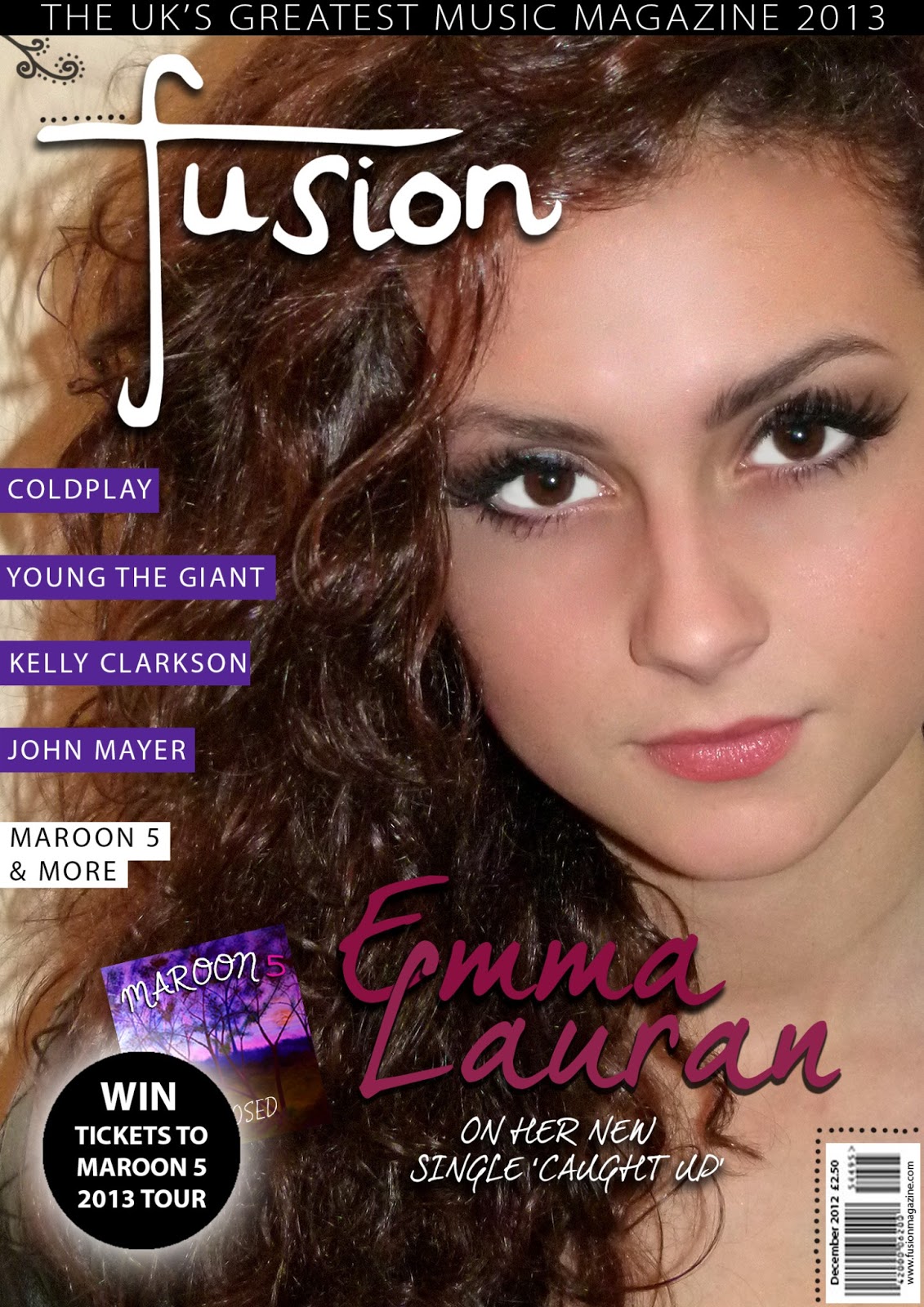
Another suggestion upon removing the swirl was to adjust the size of the 'Emma Lauran' text by making it bigger and easier to read as a result. On doing this, I realised the text underneath this article was a little too boring and so chose to change it to a more appealing font. Also, by moving the text further to the right, I saw it would look like a more organised cover if I shifted the competition advert to the right as well. 

It was pointed out to me that the black strip at the top of the page was looking a little empty and that maybe I should increase the size of the text to fill it out. Instead, I simply added to date '2013' to bulk it out and stretched the text so it made a much more appropriate tagline for my magazine.

Lastly, I took this opportunity of editing my cover to add in my own version of the album cover with my own photograph so that it would fit into the colour scheme better, whilst also enabling my cover to be completely customised and made by myself. 

My final front cover after improvements

Front Cover Photoshoot

In order to decide which photograph to use for my main image on my magazine's front cover, I made sure to take multiple pictures that I could choose from. Below are a few examples that I went through, as well as my chosen photograph. 


This first photograph was one we experimented with to see if the lighting would work with this sort of image. I soon realised that it would be necessary to use the flash as it gave my model a more appropriate look for a magazine, appealing to the consumers and highlighting my representation of youth.


As you can see, the flash created a far more appealing picture and I liked how with her hand against her head this looked slightly more edgy and relatable to my Pop-Rock genre.


This photo was more straight on against the model, and although it showed a clean image with representations of youth, it was too simple for my magazine front cover. 


My last image was the one I chose to use in the end for my cover as it combined all of the aspects I liked including an edgy feel with direct eye contact which would appeal to the target audience, representations of youth and connotations of my Pop-Rock genre. To the right is the final picture I used after editing, which you can see is a lot cleaner and sharper, whilst the brighter contrast helps my magazine to stand out more.

Thursday, 7 February 2013

Magazine Pitch

Dear Development Hell Ltd,


I am an Editor writing on behalf of a new company that is pitching to you 'Fusion', the latest music magazine.

As a contemporary magazine, 'Fusion' is particularly aimed at young people within the ages of 16-21, appreciating both up and coming and popular artists of today. We have a particular interest with music of the Pop-Rock genre which has been conveyed through the magazine, representing artists including Maroon 5, John Mayer, and Coldplay. 

From further research into various other publishing and media institutions, it was decided that Development Hell Ltd showed the best qualities when it comes to choosing a partner publisher for our magazine. Your previous successes with the market leading international dance music magazine, Mixmag, suggested that an experience with music magazines would offer professional business. 

'Fusion' looks forward to hearing from you and we thank you for your time.


Hannah Dickson - Chief Editor of Fusion Magazine


Sunday, 27 January 2013

Initial Cover Audience Feedback


In this video I asked both Sophie Christophersen and Scott Hill for feedback, including positive aspects of my music magazine cover as well as suggested changes I could make. Using survey monkey, I also requested constructive comments that I could work from to improve my work.

From all of these responses I have decided to return to my initial cover and experiment with aspects such as the swirl drawing on the model's neck, as some people thought it to look too much like a tattoo, changing text sizes and adding to my tagline. I am happy that the feedback I received was mostly positive and generally people believed it would work well as a music magazine, and even for my chosen genre of pop/rock. 


Monday, 14 January 2013

Media Institutions

The next step for my music magazine, Fusion, was to research and investigate different media institutions so that I could decide which one to market my magazine to. 

A media institution is an organisation that is responsible for the production, marketing, distribution or regulation of media textsThey are business structures that produce media texts and regulate and structure all media activities. 


Here are just a few of the institutions/ publishers that I found:

Hearst - Hearst Magazines UK was established in 1910 by William Randolph Hearst and its major interests include magazine, newspaper and business publishing, television and radio broadcasting, TV production and distribution, and internet businesses. The company is responsible for publishing magazines such as Elle, Digital Spy, Red, and SugarScape. Positives of this institution are that it has promoted many important magazines, giving me confidence that it would be a professional company. However, the fact that Hearst has not published a music magazine suggests it would have limited knowledge on how to successfully promote one like mine.

Future PLC - The biggest guitar and music-making publisher in the UK. It is responsible for magazines that promote genres such as Classic Rock, Computer Music, Future Music, Guitar Techniques, Guitarist, Metal Hammer, and Rhythm. Although the fact that the Pop Rock genre of my own magazine is not included in Future PLC's area of promotion, leaving me the opportunity to bring a unique magazine to the business, I would feel unsure about pitching to a company that does not specialise in my genre necessarily. 

Development Hell Ltd - An independent media company based in Islington, London. They currently publish the market leading international dance music magazine, Mixmag. As this institution already specialises, or has experience with music magazines, I can consider this publisher when it comes to deciding which one to pitch to.

IPC Media - The company that promotes the famous NME magazine. However, looking at the other contacts IPC Media are with, the large amount of Home, Women's, and Garden magazines also available suggest NME is a rarity, and this does not persuade me to invest in this company with as much certainty.

Immediate Media Co. - Formerly BBC Magazines, this company publishes some of the UK's most famous magazines including Radio Times, Good Food and Top Gear. Although it has promoted music magazines such as Top of the Pops and BBC Music, the fact that the BBC mainly focuses on companies within its own organisation and programmes suggests it would not be a particularly good choice.

As a result of this research I have discovered different aspects of each institution involving the positives and negatives they may bring, and now have decided to go with Development Hell Ltd, due to its previous successes with Mixmag, which I can pitch to next. 

Thursday, 27 December 2012

Stages of making my front cover


Above are the specific stages of creating my front cover which I have shown through a presentation I made on Prezi. From the completion of my magazine cover I can ask for feedback from people in my target audience and look for ways to improve.

Friday, 7 December 2012

Photoshoot Risk Assessment

This is my risk assessment which I created to consider when doing my photoshoot.