Sunday, 31 March 2013

Contents Page Photoshoot

In order to decide which photograph to use for my main image on my magazine's contents page, I made sure to take multiple pictures that I could choose from. Below are a few examples that I went through, as well as my chosen photograph. 


My first photograph was one I used to experiment with the composition and lighting of the surroundings. The model I asked to look straight to the side so you could see the profile of her face, however I felt she looked lost against the background and decided to try other positions with the guitar. 


In this next picture I made the model look slightly closer to the camera, but I still wasn't happy with the positioning. 


Above is my final picture which I selected as the one to use for my contents page. The reason for this is because it is my favourite in terms of the model's pose and the lighting that highlights her face. 

Initial Contents Page Audience Feedback

After initially completing my magazine's contents page, I decided to ask for feedback in order to progress and find ways to develop my media products. Using survey monkey, I also requested constructive comments that I could work from to improve my work.


From all of these responses I have decided to return to my initial contents page and experiment with aspects such as the title/masthead, as someone suggested I made it brighter in order to make it more apparent on the page, as well as changing text sizes. I am happy that the feedback I received was mostly positive and generally people believed it would work well as a music magazine. Furthermore, I received few ideas of change, suggesting there is little I need to do to complete this contents page and I am confident it would appeal to my chosen audiences within the genre of pop/rock.

Tuesday, 26 March 2013

Stages of making my contents page


Above are the specific stages of creating my contents page which I have shown through a presentation I made on Prezi. 

Q Magazine (2013 Issue) - Deconstruction

Front Cover:


  • Comparing this particular issue of Q Magazine to previous covers, I can see that the idea of being able to cover the masthead has also been used. This shows that the company are not afraid to hide parts of their magazine that may help to sell it because they are confident it will remain recognisable to the audience. As analysed in other Q deconstructions, the red and white colour of the masthead enables it to stand out from other competitors and draws the readers in. The tagline here 'Music Magazine of the Year', as well as 'The World's Greatest Music Magazine', set high expectations for the brand itself and create desirability to the consumers that would see this being advertised.


  • Other than the main uses of white and red, it is difficult to necessarily differentiate a recurring theme colour on this front page. At the top of the cover white has been used to create a simple but effective background to feature important information and advertise key aspects of the magazine. Perhaps the gold border has been used to emphasise the special edition and could connote the importance and class of this magazine.  


  • In the centre, a white square has been included to highlight the greatest feature of this particular issue - 'Perfect Playlists' involving well known figures such as Robbie Williams and Noel Gallagher. Not only does this highlighting technique clearly emphasise the magazine's best features, but the colouring allows the album artwork around the edges to stand out and surround the cover in an almost frame like style. Furthermore, it could be considered that the white colour shows connotations of this 'perfection' that is being advertised, so that ties in well. 


  • Appropriate fonts have been used in certain areas of the front page and all remain readable and have a sense of simplicity. The coverline/hook in the bottom left uses a quote paired with a famous celebrity to draw in the readers, whilst the ripped paper border helps to seamlessly blend into the cover, making it visually appealing to the eye.

Contents Pages 

It is particularly important to analyse the contents pages as not only have I completed my front cover already, but I am currently in the stages of working on my own contents page. Therefore, I should pay close attention to the codes and conventions used as to inspire my own work, although in this case the contents page is spread across three pages rather than one. 


  • From a glance, this contents page appears to be fairly busy and slightly confusing, however when you inspect the different aspects you can see that they have been cleverly laid out to draw in the readers. For example, the use of images of artists layered over the top of some texts and other images creates an almost 3D effect that makes the page more interesting for the consumers to look at. The large amount of dark, black colours have been balanced out with the highlights of red and white spaces, creating a clean and modern effect. I can see a letter from the editor welcoming the readers to the magazine has been included, which has made me decide that I will definitely include one of my own in my magazine's contents page. 

  • A variety of articles and features of this magazine have been advertised through page number referencing and brief information over photographs, which I will definitely make sure to use for my own contents page. Furthermore, as this contents spreads over a total of 3 pages, I can see extra details and contact information have been placed on the third page; despite me being reduced to only 1 page, I shall definitely include brief contact details so that my magazine has a professional feel. Overall, I feel that although this example is fairly busy and almost confusing to look at, it holds many appropriate conventions of a magazine that I should take note to incorporate into my work as they are found to be extremely successful with audiences. 

   Double Page Spread 


Moving on to the next magazine feature, it is also particularly important to analyse the codes and conventions as well as those used for the contents page as I am in the process of creating my own double page spread too. 


  • The artist of the 'Sing Out Sisters' has been featured, with a full page sized image on the left, and a page of text on the right. The capitalised, bolded, large text at the bottom takes up nearly one third of the double page spread, clearly explaining the artists within the article and selling this section of the magazine. This would not only be easy to read, but would also create interest for the readers of these artists who may not be well known to the audience. 

  • The main image itself presents three young women with happy expressions, engaging with each other. The fact that they are positioned together without having eye contact with the camera shows that it is not necessarily a key feature to have in order to maintain interest with the readers, as this image is still fun and well designed. Text placed over the borders of the photograph includes extra information about the sisters that is not particularly needed in the article itself - a feature I may choose to include in my own products.

  • Looking at the article, a simple black text on a white background with a basic font has been used, separated into 3 columns. 

  • A strip of 3 images showing the artists in action, with further text placed over the image is placed in the centre of the right page, emphasising the recurring theme of 3 in this article for the 'Sing Out Sisters'. 

Front Cover Improvements + Final Cover

From my initial cover audience feedback, where I asked people who would fit into my target audience of older teenagers, I decided to make a few changes to improve my front cover. 

My initial front cover
My first suggested improvement from feedback was to adjust the swirl drawing on the model's neck, as it was often being confused for a tattoo and almost made that area of the cover look too busy. Therefore, I decided to remove it completely as I was happy with just the one doodle in the top left hand corner in order to bring fun to my magazine.

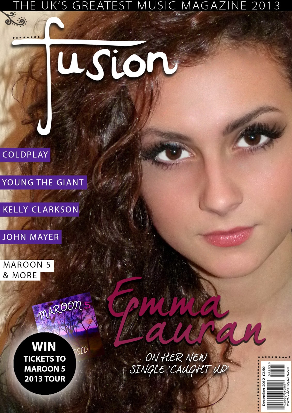
Another suggestion upon removing the swirl was to adjust the size of the 'Emma Lauran' text by making it bigger and easier to read as a result. On doing this, I realised the text underneath this article was a little too boring and so chose to change it to a more appealing font. Also, by moving the text further to the right, I saw it would look like a more organised cover if I shifted the competition advert to the right as well. 

It was pointed out to me that the black strip at the top of the page was looking a little empty and that maybe I should increase the size of the text to fill it out. Instead, I simply added to date '2013' to bulk it out and stretched the text so it made a much more appropriate tagline for my magazine.

Lastly, I took this opportunity of editing my cover to add in my own version of the album cover with my own photograph so that it would fit into the colour scheme better, whilst also enabling my cover to be completely customised and made by myself. 

My final front cover after improvements

Front Cover Photoshoot

In order to decide which photograph to use for my main image on my magazine's front cover, I made sure to take multiple pictures that I could choose from. Below are a few examples that I went through, as well as my chosen photograph. 


This first photograph was one we experimented with to see if the lighting would work with this sort of image. I soon realised that it would be necessary to use the flash as it gave my model a more appropriate look for a magazine, appealing to the consumers and highlighting my representation of youth.


As you can see, the flash created a far more appealing picture and I liked how with her hand against her head this looked slightly more edgy and relatable to my Pop-Rock genre.


This photo was more straight on against the model, and although it showed a clean image with representations of youth, it was too simple for my magazine front cover. 


My last image was the one I chose to use in the end for my cover as it combined all of the aspects I liked including an edgy feel with direct eye contact which would appeal to the target audience, representations of youth and connotations of my Pop-Rock genre. To the right is the final picture I used after editing, which you can see is a lot cleaner and sharper, whilst the brighter contrast helps my magazine to stand out more.

Thursday, 7 February 2013

Magazine Pitch

Dear Development Hell Ltd,


I am an Editor writing on behalf of a new company that is pitching to you 'Fusion', the latest music magazine.

As a contemporary magazine, 'Fusion' is particularly aimed at young people within the ages of 16-21, appreciating both up and coming and popular artists of today. We have a particular interest with music of the Pop-Rock genre which has been conveyed through the magazine, representing artists including Maroon 5, John Mayer, and Coldplay. 

From further research into various other publishing and media institutions, it was decided that Development Hell Ltd showed the best qualities when it comes to choosing a partner publisher for our magazine. Your previous successes with the market leading international dance music magazine, Mixmag, suggested that an experience with music magazines would offer professional business. 

'Fusion' looks forward to hearing from you and we thank you for your time.


Hannah Dickson - Chief Editor of Fusion Magazine